
A good example of how the truth can be blurred
A photograph is that it's neutral. It captures a moment in time. It's unbiased and true.
Or is it?
Here is a great video showing six different photographers who are given pre-conceptions about a man and shoot six very-different portraits.
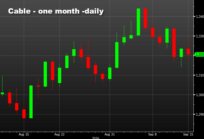
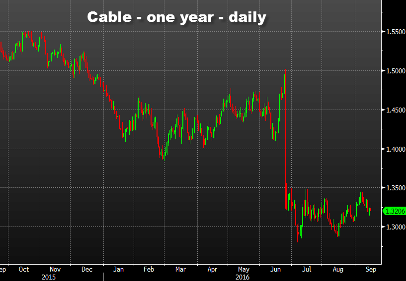
Charts are seen as something even more objective. A candlestick chart shows the high, low, open and close. Those are objective facts.
Yet how a chart is cropped or cut can change the impression.
The one-month daily cable chart is in a decent little uptrend.
Meanwhile, the one-year chart of cable is a trainwreck.
Adding lines and technical analysis to the chart skews the picture even further.
The lesson is that unbiased information, even at the most elementary level, is clouded. Draw your own lines and your own conclusions. Then compare those to the ones others are drawing. Keep an open mind and never fall too deeply in love with any market portrait.

