December 6, 2016. The GBP is the strongest. The AUD is the weakest
....but the changes are really nothing to shout home about...
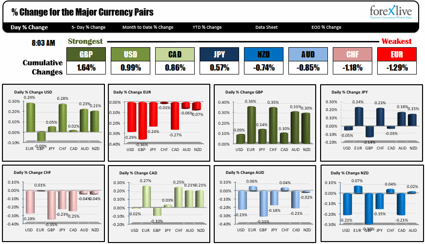
The snapshot in the charts above show the % changes of the major currencies vs each other as NA traders enter for the trading day.
To determine the strongest and weakest currency, the program will accumulate the percentage changes up or down of each major currency vs each other. The currency with the highest total (today it is the GBP at 1.64%) is the strongest. The one that has the most negative total is the weakest (today it is the EUR at -1.29%a).
The percentages do not indicate that the GBP is stronger by 1.64% today. It just means the % changes of the GBPUSD, GBPEUR, GBPJPY, GBPCHF, GBPCAD, GBPAUD and GBPNZD total 1.64%.
The other thing is it is not a trade weighted value. That is the EUR does not get more weight vs the USD because there is more trade between the two. That is the what happens with the dollar index (DXY).
The changes are from the close from yesterday (at 5 PM ET).
Finally, if dollar is stronger vs the EUR by 0.29%, the EUR is weaker vs the dollar by -0.29%. So that means all the totals of % changes if you added them all together would sum to 0.0% (and they do)
For me it is a visual of where the action is taking place. It does not predict what may happen in the future but it shows what currencies have done so far today.
Today, the % changes coming into the day are not all that great. That is the total of 1.64% for the GBP is not that far from unchanged. Yesterday, the sum of the strongest currency at this time was the EUR at 3.80%. The weakest was the NZD at -5.07%. So today is little changed day right now.
.
I will always also look at the USD % changes. Needless to say the USD today is mixed today with it up vs the EUR, JPY(close to unchanged), CHF, AUD, CAD (really unchanged) and NZD but down vs. the GBP. Seeing what is up and down gives me an feel about the crosses. For example, if dollar is strong vs. the EUR (EUR weak) and weaker against the GBP (GBP stronger), that tells me the EURGBP is weaker. Get it?
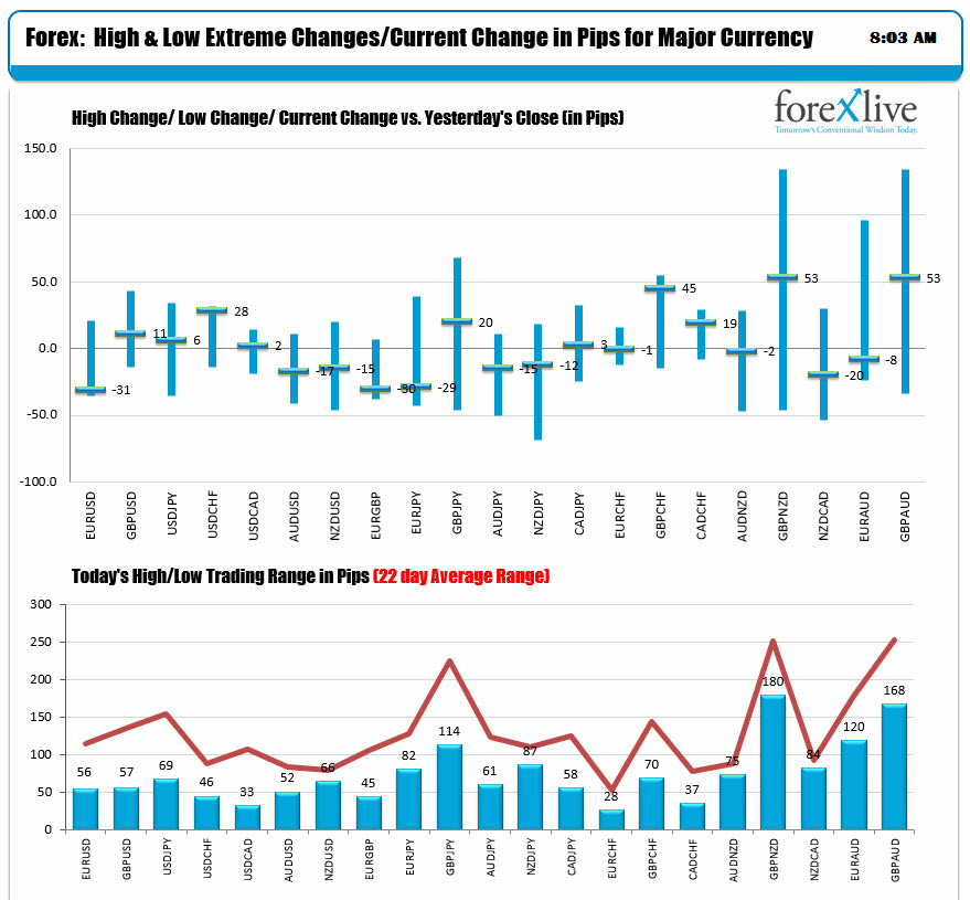
The changes and ranges chart below is another set of charts I look at first thing. The tops chart simply charts the tick change from unchanged - up and down. So for the USDCAD which is nearly unchanged, it shows that the pair is up 2 pips from unchanged in the snapshot. The line is not that large for that pair, and the change is more or less in the middle of the up and down range.
The lower chart tells you the exact trading range (in pips) for each of the pairs. So for the USDCAD, the range is 33 pips and we are 2 pips up on the day. The red line in the lower chart shows the 22-day average trading range for each of the pairs. So if the range for the USDCAD is 33 pips, and the average over the last 22-days (which is my proxy for a trading calendar month) is just over 100 pips, I like to think "there is room to roam". That is, by the end of the day, the USDCAD will extend one way or the other. Today all the pairs (including major crosses) have room to roam if it gets a nudge. So if there is a break, with momentum, you can anticipate a continuation. It does not always happen, but your mind is looking for it. Alternatively, if the ranges were really large or near the 22 day average, that might imply, that we might not extend or have room to roam.
SO that is a quick look at what this all means.