
A broad look at fundamental trends and what they mean
OK. I admit it, I am a tech-y. That is I look at technical charts to make trading decisions predominantly. Those charts tell me things about trends (or non trends) in the currency market. Those charts tell me about support and resistance and with it define my risk. They show me what other people may be thinking logically from what both they and I see.
You may be a fundamental traders, but have you ever thought that you can also analyze the trends of the fundamentals technically? After all, a chart is a chart. A chart of employment can show you the trend. It can show you if employment is trending higher or lower. Economists do say, the employment trends feed on itself. Putting it another way, "Jobs beget more jobs". Knowing the trend in employment is key for a fundamental trader. You can see and analyze that in a "technical" chart.
Inflation can also trend. That is, inflation can beget more inflation, or in present day, lack of inflation, can beget less inflation - or even the prospects for deflation.
Now we know the Federal Reserve Bank is supposed to control inflation and employment in the United States. Typically those economic measures work together. That is... if employment is robust and trending, inflation rises. If employment is not great and trending lower, inflation falls.
In the current environment, the trends in US employment seems good, but the inflation trend is well, not so good. The Fed members who are hawks look at the inflation trends as transitory as a result of lower oil and other commodity prices. Are they indeed transitory? What do the trends look like? Does the Fed have a case to "liftoff" in 2015 (or even in Q1 2016?) given the mandate for inflation/employment (and perhaps growth)?
Below are a collection of charts that show the trends in the US economy. What are the charts saying to you fundamentally from a technical perspective? You may more of a fundamental trader and not be a technical trader, but that does not stop you from looking technically at a fundamental tool you use for your trading.
So lets look at some charts and see what they say to us...Who knows, maybe it might tempt you to come over to the "black magic tech side" ; )
Inflation:
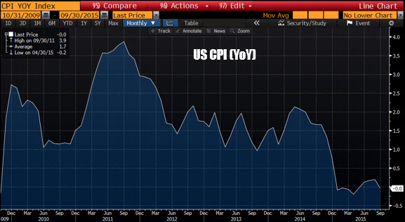
CPI (Consumer price index): The headline CPI is hanging around 0.0%. Needless to say not anywhere near the 2.0% target. The trend is going sideways. in the near term after trending to the downside. Is it potentially bottoming? Perhaps but what we can see is that at 0.0%, it is not likely a huge concern.

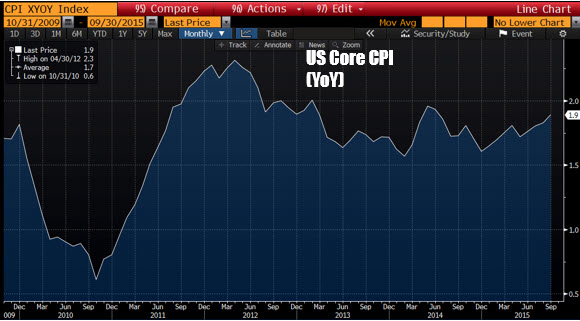
What if you took the more volatile food and energy out of the equation. They call that the core CPI. Looking at the chart below, the core CPI inflation is certainly higher that the "headline" number. However, the chart shows that it remains below the 2.0% comfort or target level. In fact, the core CPI has not been above 2.0% since July 2012.
By seeing the trends in the headline CPI at 0.0% and the core at 1.9%, you have a clearer picture of the trends in inflation and perhaps the future trends. If things like food and energy were to increase, what might you expect to happen to the core inflation? It would go higher and above the 2% level. This is what the Fed members are thinking when they anticipate more inflation. They see the core trend just below 2% but understand, it might be a modest move higher in oil or food, that could tick that trend more to the upside.
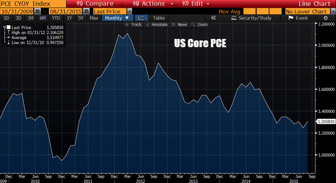
Another measure of inflation the Fed like to look at is the core PCE: The core PCE measures the price changes for goods and services purchased by consumers. Looking at the trends in this measure of inflation, the trend is not so positive. In fact, it remains near low levels going back to 2011. The trend in this measure of core inflation is not as strong as the core CPI. This suggest perhaps inflationary pressures should not be a concern for Fed officials. If so, the fundamental picture for the dollar might not be so bullish (all things being equal).
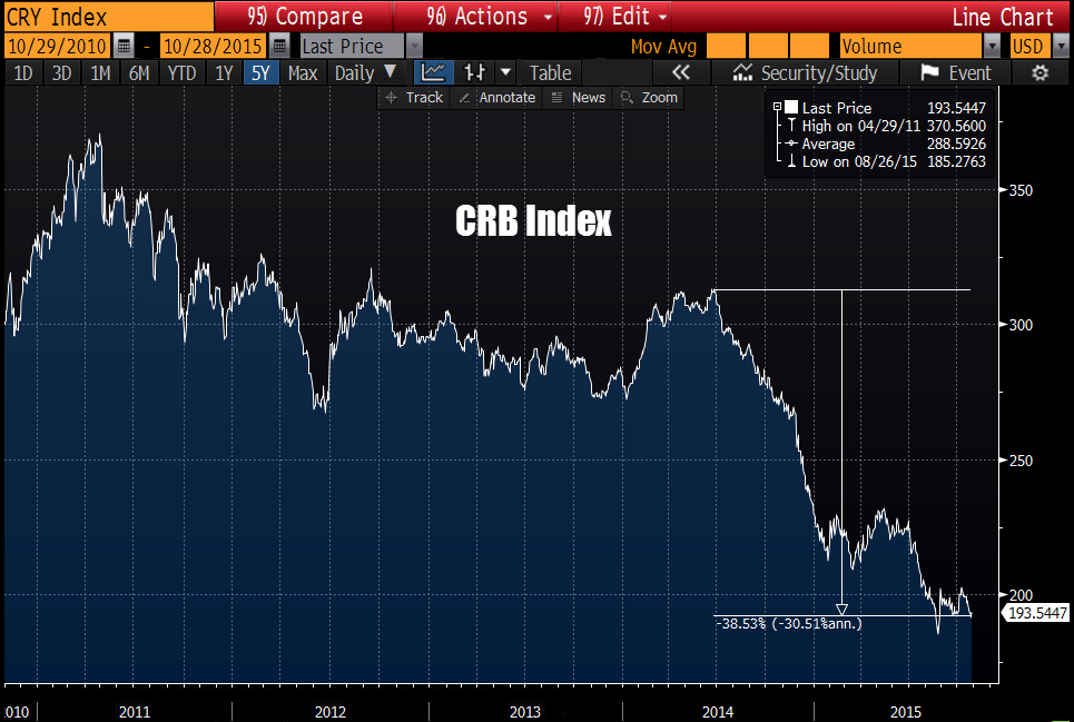
What if you looked at the trends of a basket of commodities? That might include livestock, energy, industrial, soft commodities, etc. The Thomson Reuters/Jefferies Core Commodity CRB Index (CRB stands for Commodity Research Bureau) is an index view of a basket of commodities including hard, soft, energy, industrial etc. The index has been on a steady decline and sits near low levels going back to 2002. That is a long time ago. In fact, the decline since the recent peak in June 2014 is 38%. If commodity prices are trending lower, what does that say about future inflation or economic activity for that matter? That it is not very robust. The trend of this chart is most definitely saying inflation is not in any risk of moving higher.
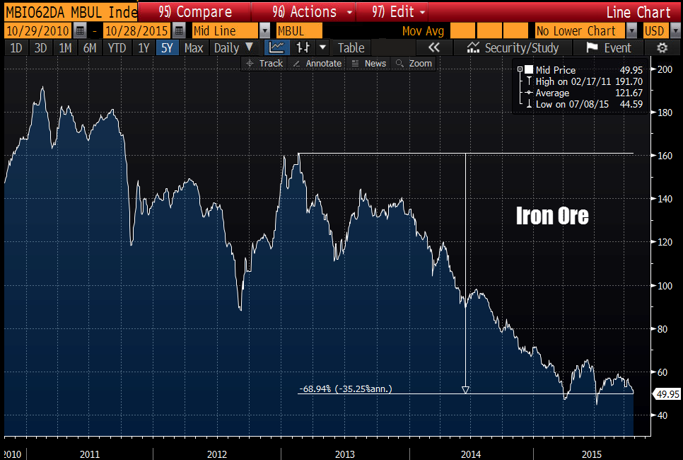
What if you want to drill down and measure the trend in demand for raw materials in China. China is the 2nd largest economy in the world and they have been fueling the trends in global growth by their infrastructure expansion. If trends are good, there should be demand for industrial metals like Iron ore.
The Iron ore 62% delivered to Qingdao China price is a measure of price of iron ore and demand by China, a chief consumer of the metal. Looking at the chart below, the price of Iron ore is sitting near all time low levels. To give you a better idea, at the peak in 2011, the price was at 183.59. That is a BIG FALL. The current price is 49.95. The decline since Feb 2013 is 69% What does that say about the 2nd largest economy AND about inflation of industrial metals? I see WEAKER from that chart.
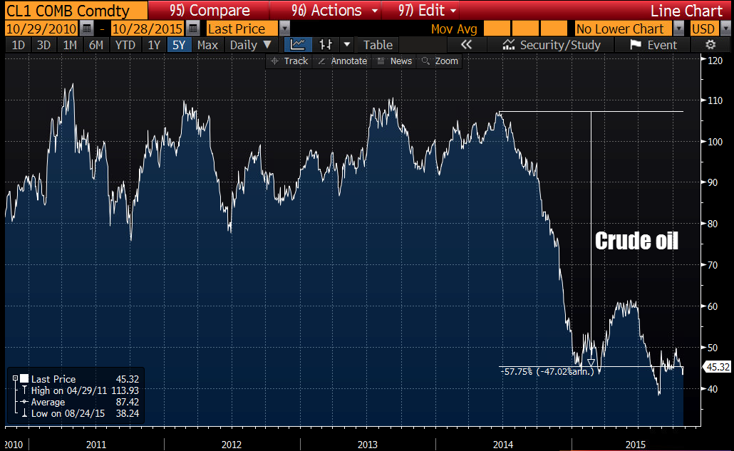
Crude oil? Crude oil is a huge cost in most businesses and for individuals as well. The trends in crude can be driven by demand - if demand is down because the economy is slowing, the price will go down. It can also be driven by supply. IF there is more fracking in the US, there is more supply and that could lead to lower prices. How does the trend impact inflation? How will it influence Fed policy. If oil starts to bottom, we could start to see the core inflation start to pick up. Right now, this chart is consolidating near the lows, but a modest rise earlier in the year was stopped at $60 per barrel. Well below what was a floor going back to 2010 at the $80 a barrel area.
By looking at the trends, from these inflation gauges, the trends are not for higher inflation. So the overall inflation trends are not supporting a change in policy.
The mandate is a dual mandate for the Fed. So what about the employment trends?
Employment:
As mentioned before "jobs beget more jobs". They also can ignite inflation as more workers spend more on goods and services. They also potentially can increase wage inflation which forces companies to increase prices.
So how do the charts of the employment trends look?
The overall employment story is more of a bright spot, but there are some concerns.
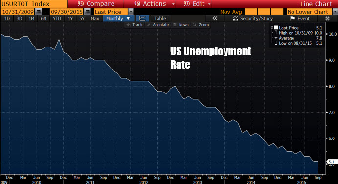
The first chart most want to see is the trend in the Unemployment rate. That trend most definitely shows a downward trend as the unemployment rate stands now at 5.1%. Fed projections call for a continuation of that trend as "jobs beget the need for more jobs" . At some point, the structural unemployment rate - that is the low floor caused by job displacement and other factors - will be reached and that should increase wage pressures. This is a check in the positive column for those Fed officials who see future inflation as a result of wage inflation. Does this chart tell us about wages? No. It may be that people who lost higher paying jobs are no accepting lower paying jobs So the trend is down, but it may not be a "so great" down.
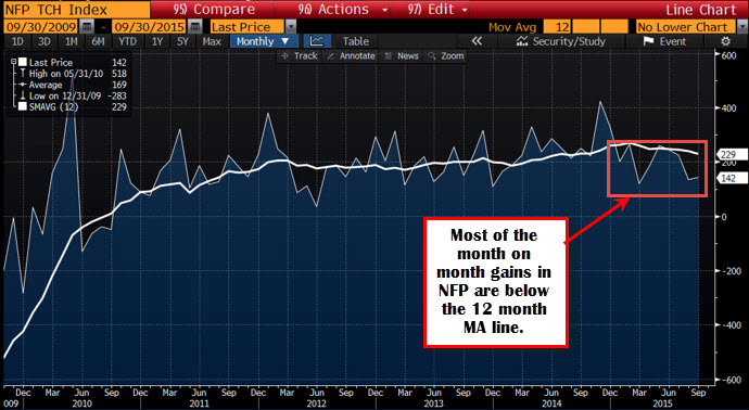
Another trend in jobs you can follow are for Non Farm payrolls. In this chart it shows that Non Farm payroll jobs have started to slow. Some are suggesting that this trend is because the employment situation is near full employment and therefore is a precursor for higher wage inflation down the road. Perhaps? That will start to show up in wage data.
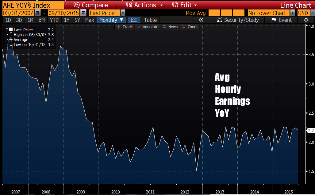
Average hourly earnings (YoY) is an indication of wage inflation. The chart below shows the average hourly earning growth for workers. What is that trend showing? It does show wer are near higher levels going back to 2010 but only going back to 2010. The earnings growth remains contained especially given concerns about full employment. So far, wages are not racing ahead. The trends are still contained.
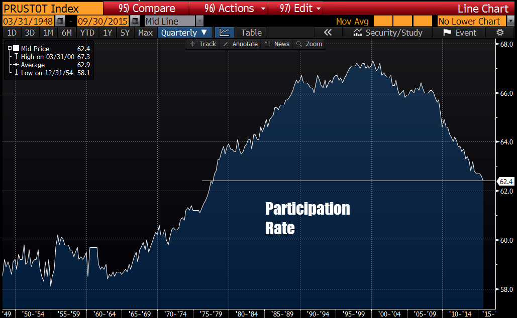
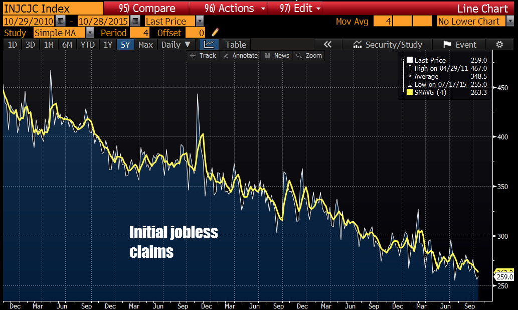
Other employment charts include the participation rate and the weekly jobless claims.
The participation rate used to be a concern but has taken a back seat of late. Nevertheless it is a negative in the employment picture as it stands at the lowest level since 1977. Is the participation lower because people are discouraged or is it because more people are retiring. Unfortunately, the chart does not tell us that.
Initial jobless claims continue to trend down suggesting a strong employment picture. If less people are reported as jobless, it is indication that layoffs are trending lower. Workers are staying employed.
GDP
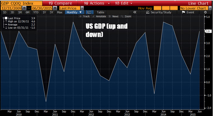
The trends in the GDP measure a countries real growth given the good, bad and ugly. The GDP trends outlined in the chart below, have been about spikes higher and steep falls. The 2Q GDP came in at 3.9% but 3Q estimates are tracking around 1-1.5%. The up and down trend continues and tells the Fed and traders the difficulty from a global economy which is still suffering from the hangover from the 2008 economic crisis.
Other stuff....
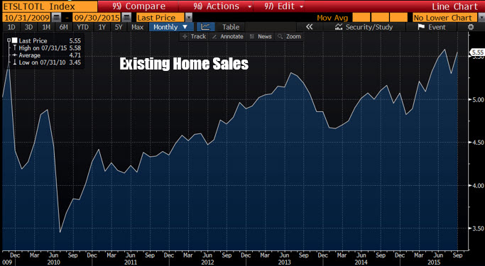
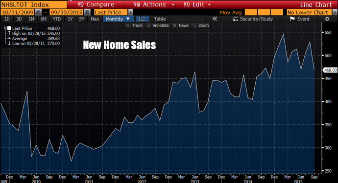
The trend in the US housing is doing relatively well with recent gains after recovering from the 2013 decline.
- US stocks corrected but survived a bigger correction. The trend is more consolidative.
- Other global stock markets are recovered with European stocks benefiting from QE before the big October correction.
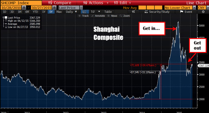
- China and emerging economies are a story and a concern. The Shanghai composite had the problem of soaring, suckering people in and then tanking. The transition of the economy is also a big concern.
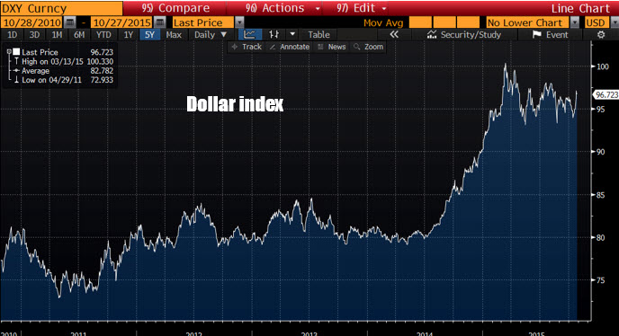
- The high dollar also hurts multinational domestic companies. This is in effect doing some tightening for the Fed.
When looking at the economy from a fundamental perspective, traders can use simple technical concepts in determining the trends. Whether it is inflation, employment, GDP, housing, it all works.
This perspective of the US economy - from this snapshot in time - the glass may not be totally empty as employment, housing, stocks, some measures of Core inflation are not doing too badly. However, the trends also show in other measures like wages, PCE core inflation, commodity prices that the glass is not totally full either.
Of course, part of the process the Fed and other central bankers need to do, is to not only look at where we have been, and where we are, but where we may be going as well. The economic charts, help show that picture.

